Typography
We principally use two font families across the site; Rundeck Smooth and Open Sans.
How we use the fonts:
- Rundeck Smooth for headers
- Open Sans for Body Text
Font Sizes
Font sizes are named semantically and map to heading sizes, following a ratio. Font sizes are listed in rem units1
- Heading 1
- Heading 2
- Heading 3
- Heading 4
- Heading 5
- Heading 6
- Paragraph
- Small
Font Weights
We use a 400 and 700 values
- 400
- 700
Colors
Primary Colors
Primary colors define a brand. Botzina uses a vibrant 5 color palette composed of primary colors, as well as a white and black.
Botzina Black
#000
Botzina Green
#149954
Botzina Red
#E4322B
Botzina White
#fff
Botzina Gold
#FFDE59
Secondary Colors
Secondary colors are used to complement primary colors, and to provide in-between colors for visibility and accessibility. The muted colors are based on the existing primary palette.
Muted Green
#357856
Muted Red
#B55C59
Botzina Gray
#808080
Muted Gold
#D5C481
Color best practices
Use strong contrasting colors
WebAIM has a contrast checker. Use colors that are easily readable and have a high contrast. High contrast colors keep your site readable for those with low vision.2
Don’t:
Gray on Green
icky
Do
Botzina black on green
Another existing color
Avoid the christmas effect (Red and Green)
Don’t use a green color next to a red color, or vise versa. If using the colors together, use another color in between the two.
Don’t:
This is horrid
As is this
Do
Better
As is this
Use the existing palette
Use the palette that we have created, or work with our community for new colors. Do not create new colors or use non-botzina colors.
Don’t:
Random Blue
OOF
Do
Botzina black on red
Another existing color
Images
Take pictures – Put them in! We use the 1×1 and 16×9 aspect ratio.
Examples

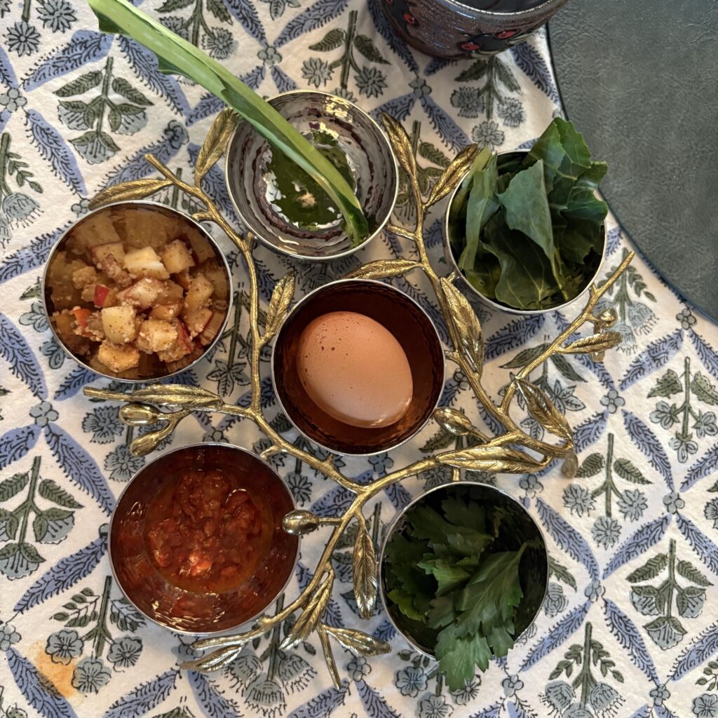
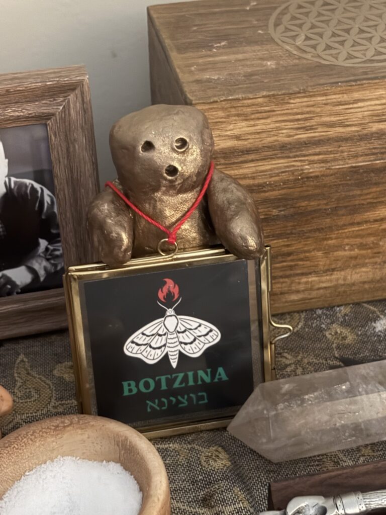
Best Practices
- If it involves a person, get permission before posting.
- We use 1×1 and 16×9 aspect ratio images
- Every image that is not for decoration (Not an icon) needs alt text. Any text on an image needs to be transcribed to the alt text or captioned.
- Crop and correct photos before uploading them. Do not use the included cropping tool.
Content
Best Practices
- Use headings3 and other semantic elements.4
- Use your natural voice.
- Use your natural tone of voice.
- Do not use this site to harass or defame.
- When possible, link to sources or other pages on the site.
- Use everyday language. If using Yiddish, Hebrew, or another language inside a page, provide a translation or definition.
- Stuck? Ask for help!
- See https://www.w3schools.com/cssref/css_units.php for more information on CSS units. ↩︎
- For more information on color contrast and design, read the W3C guide to design ↩︎
- For information on Heading Blocks, from the WordPress documentation ↩︎
- See W3schools for more information on semantic elements ↩︎